At AKKA we are bridging the two easts,
from the Middle to the Far East through
our love and celebration of the pomegranate.
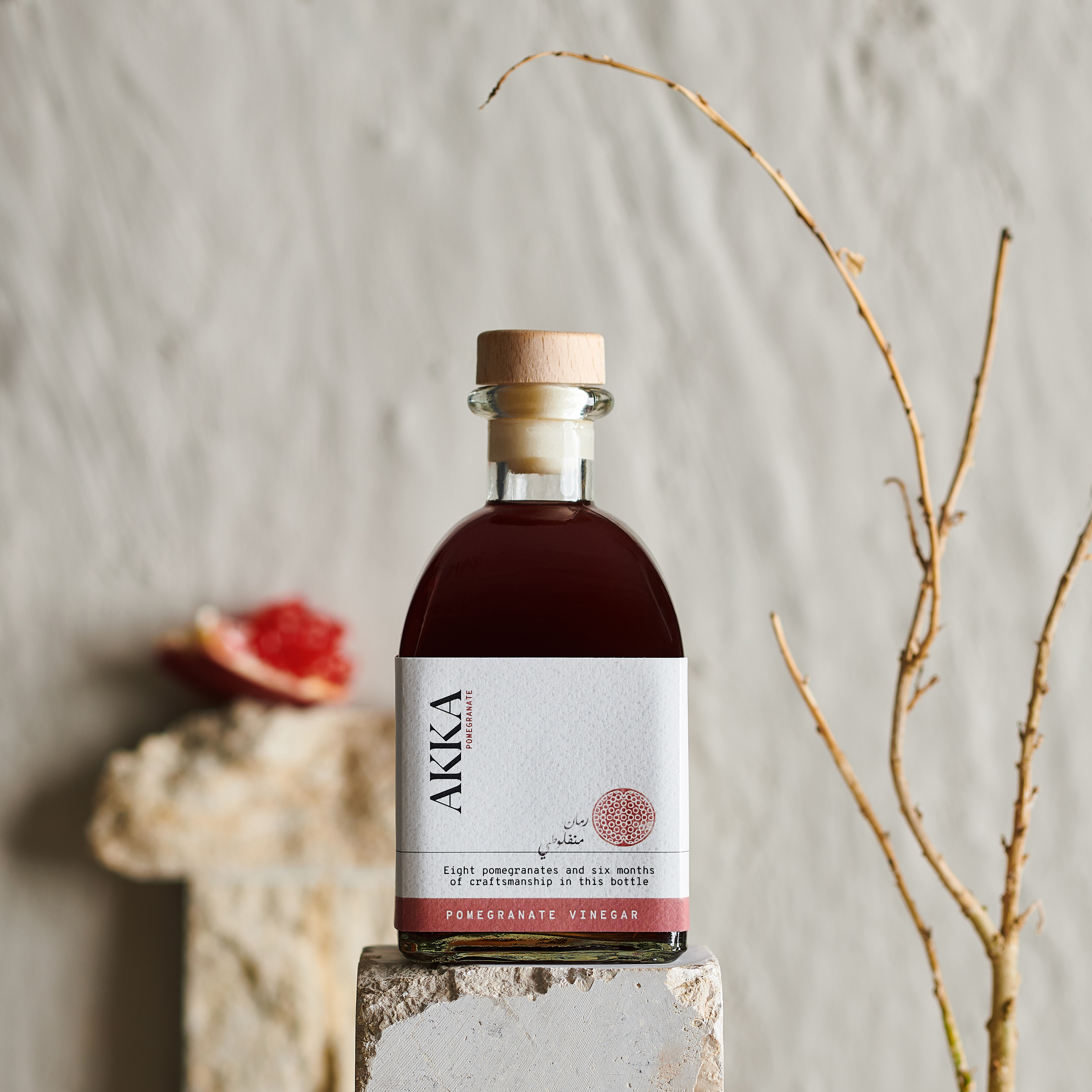
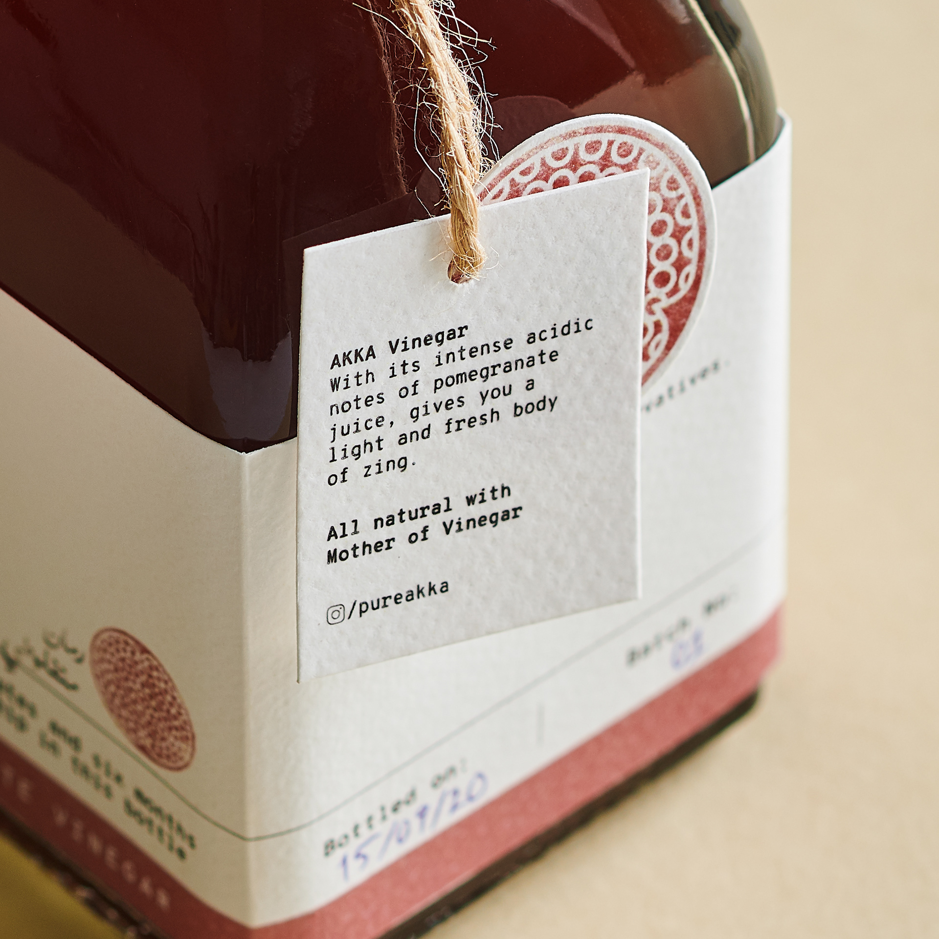
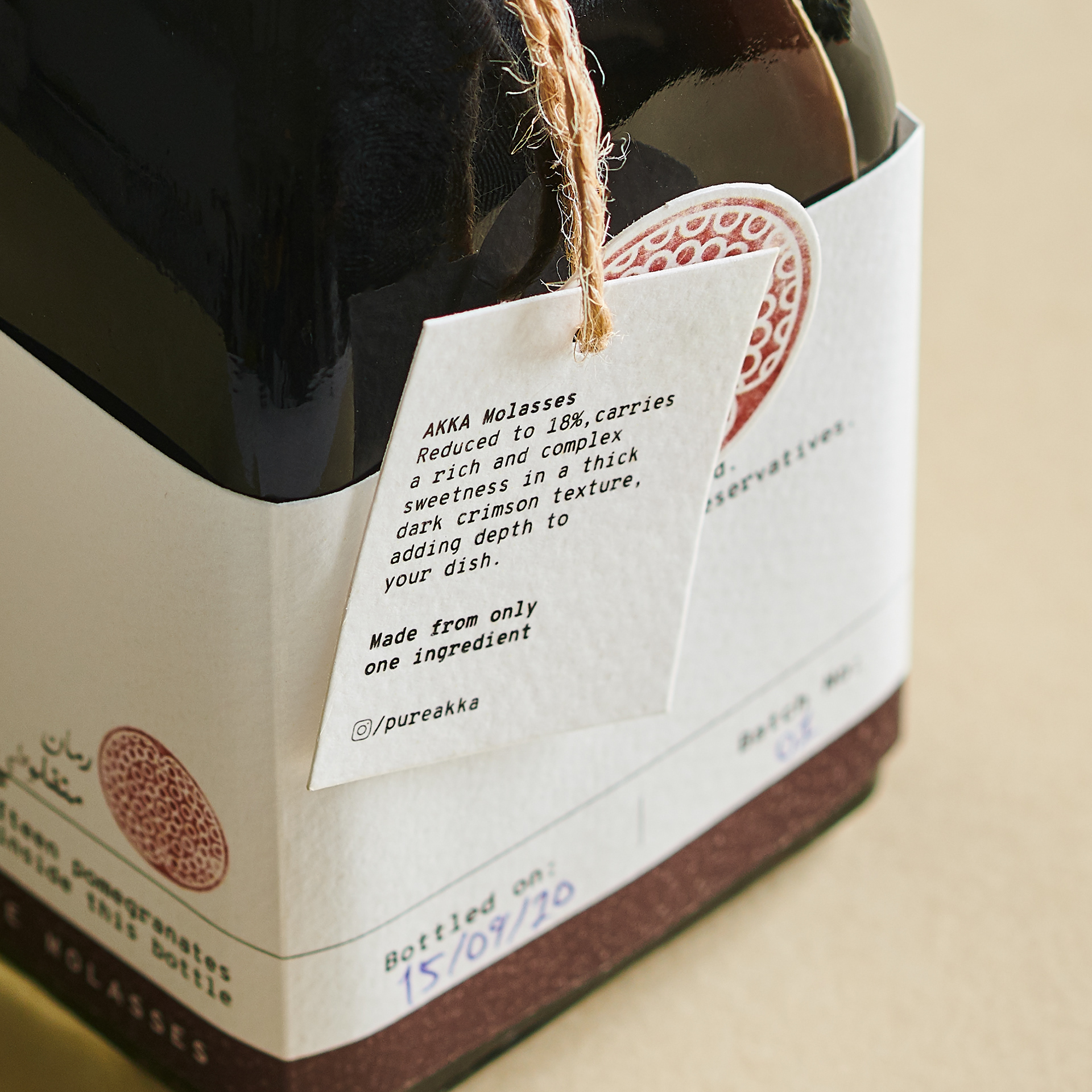
AKKA is an Egyptian brand from the heart of Cairo. We were asked to create a brand identity and packaging that could stand out from other brands available in the market at that time. ‘Aka’ means red in Japanese. The design concept is driven by AKKA’s production
philosophy that honours Japanese workmanship and minimalistic culture.
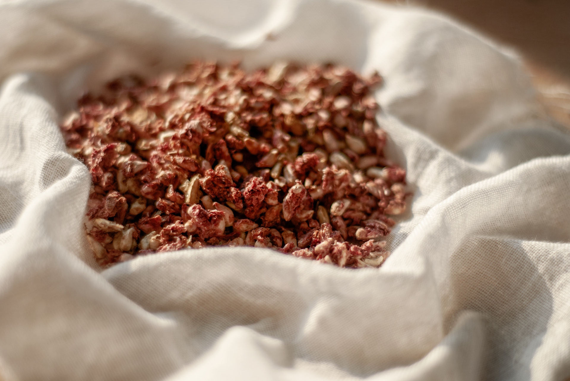
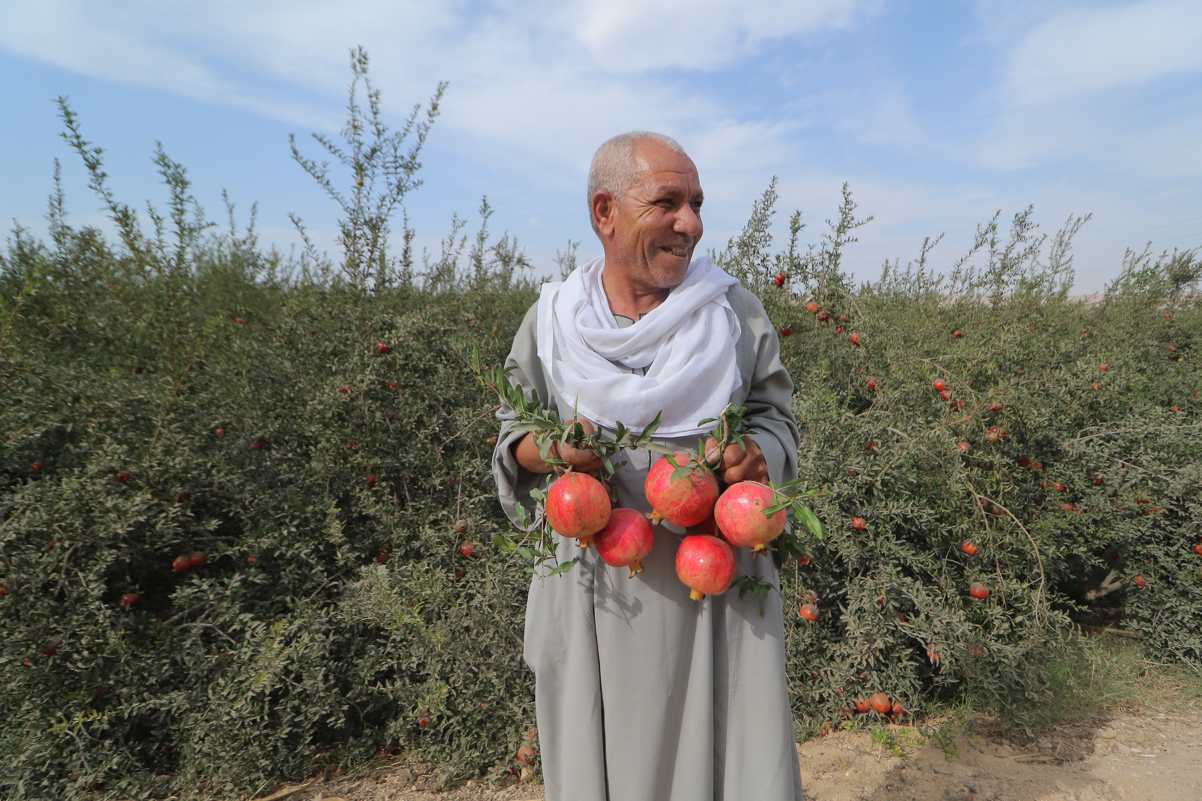
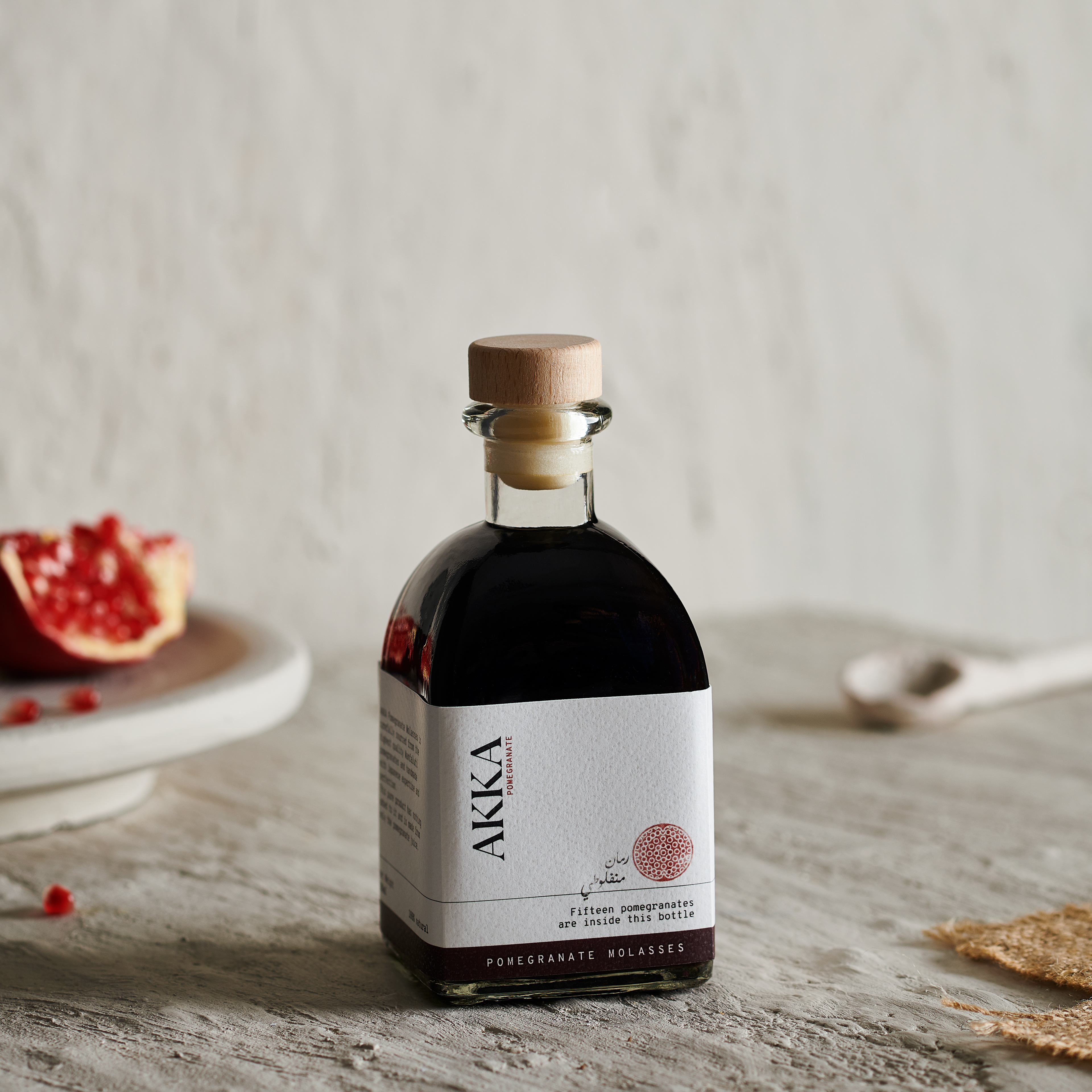
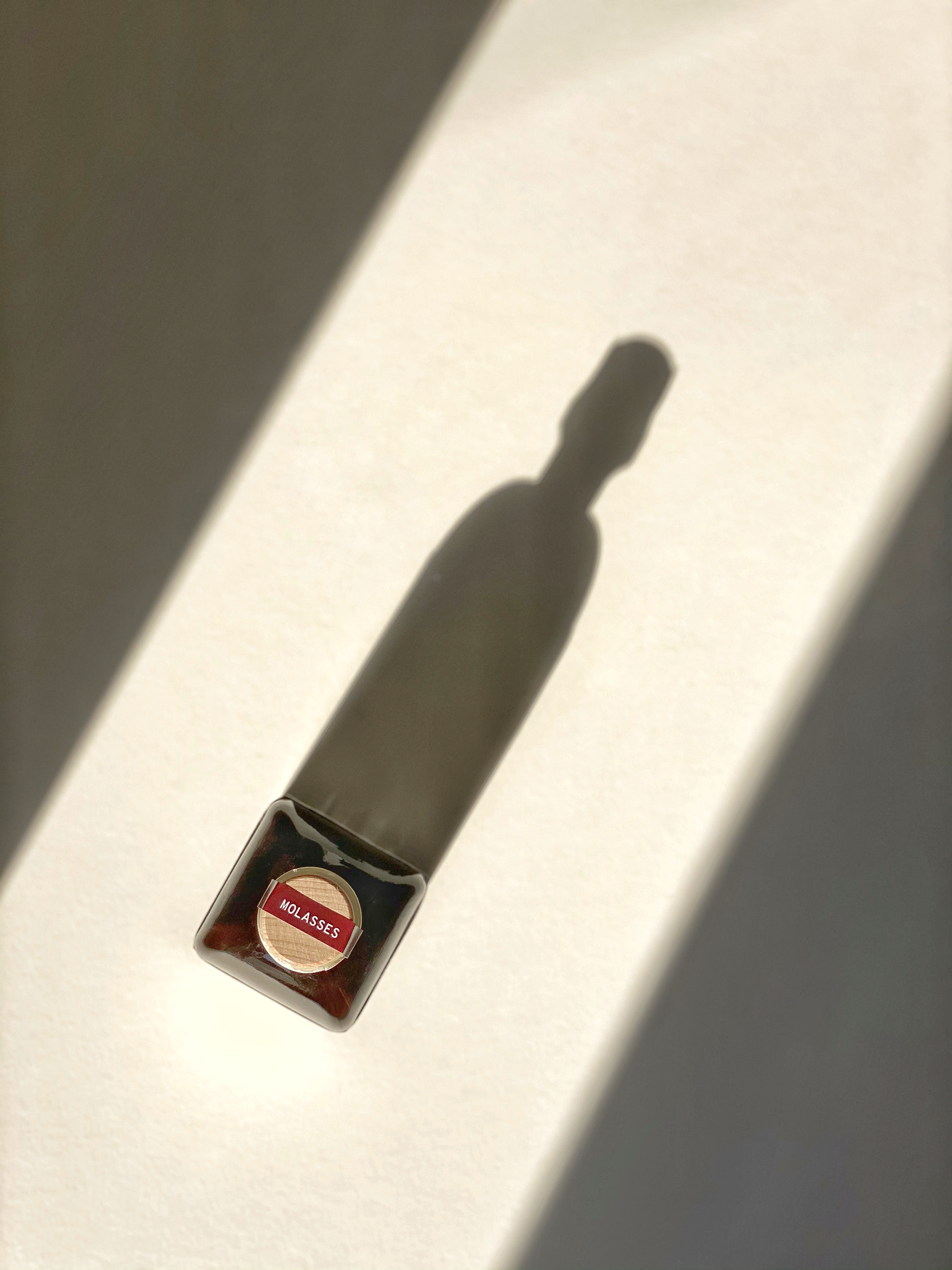
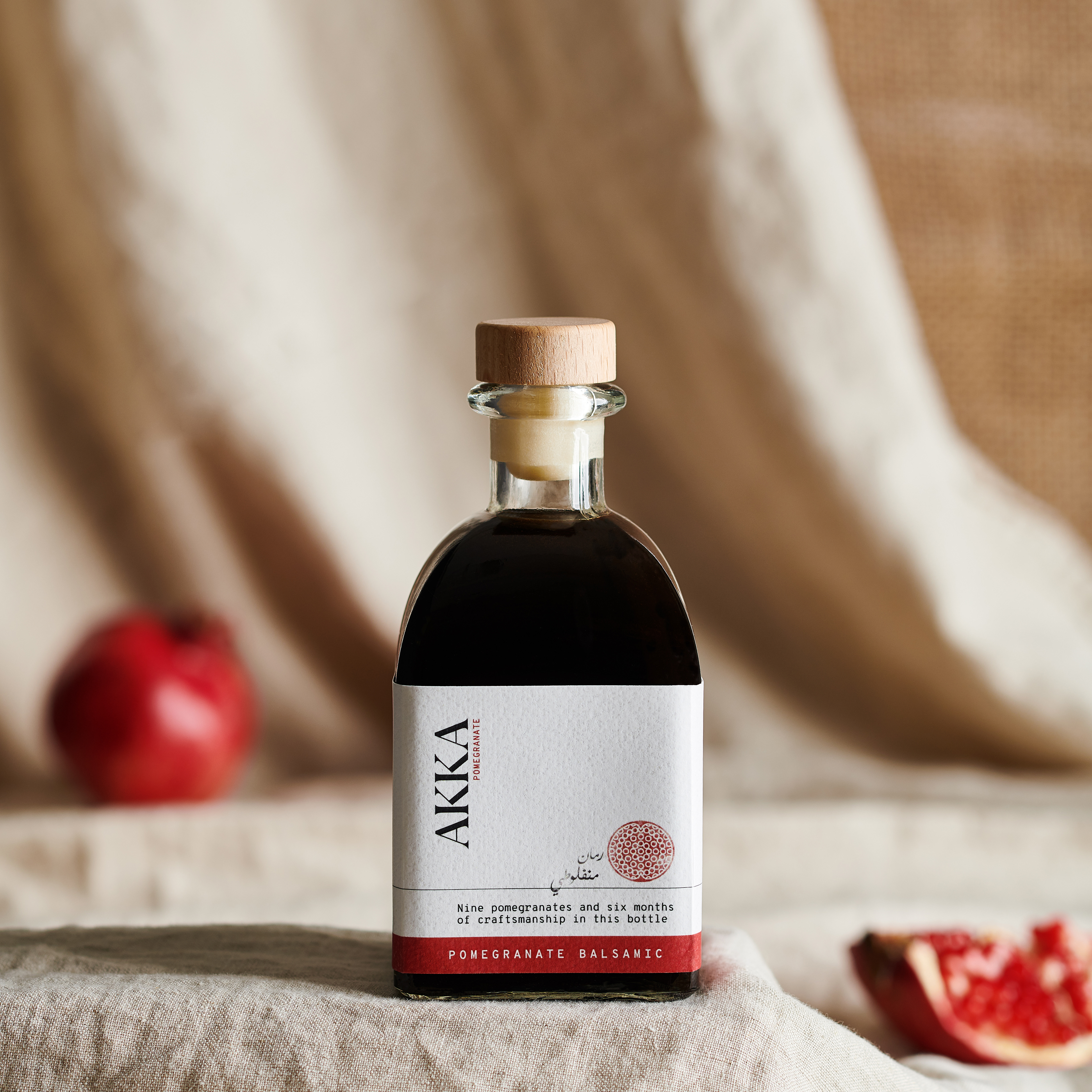
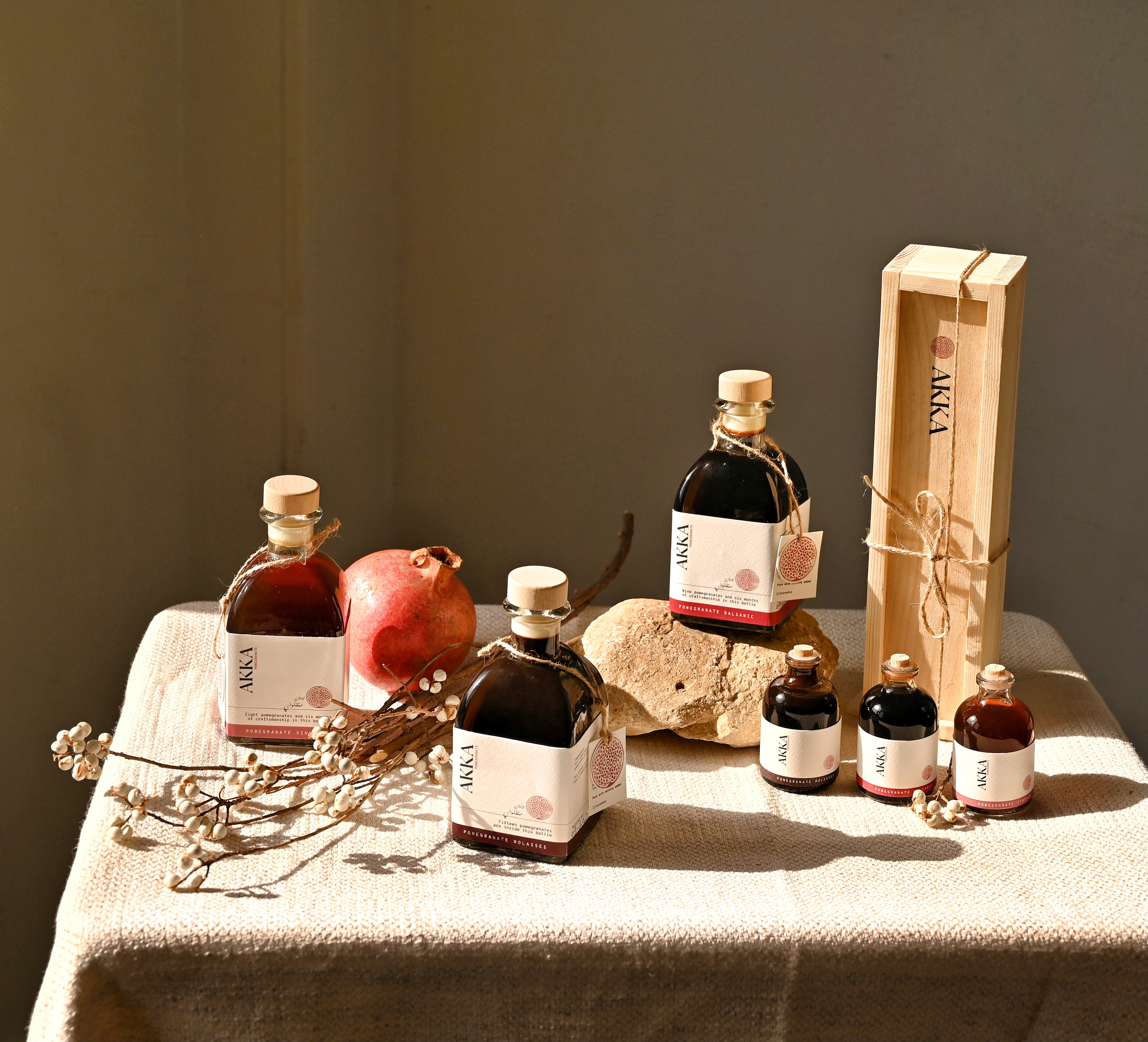
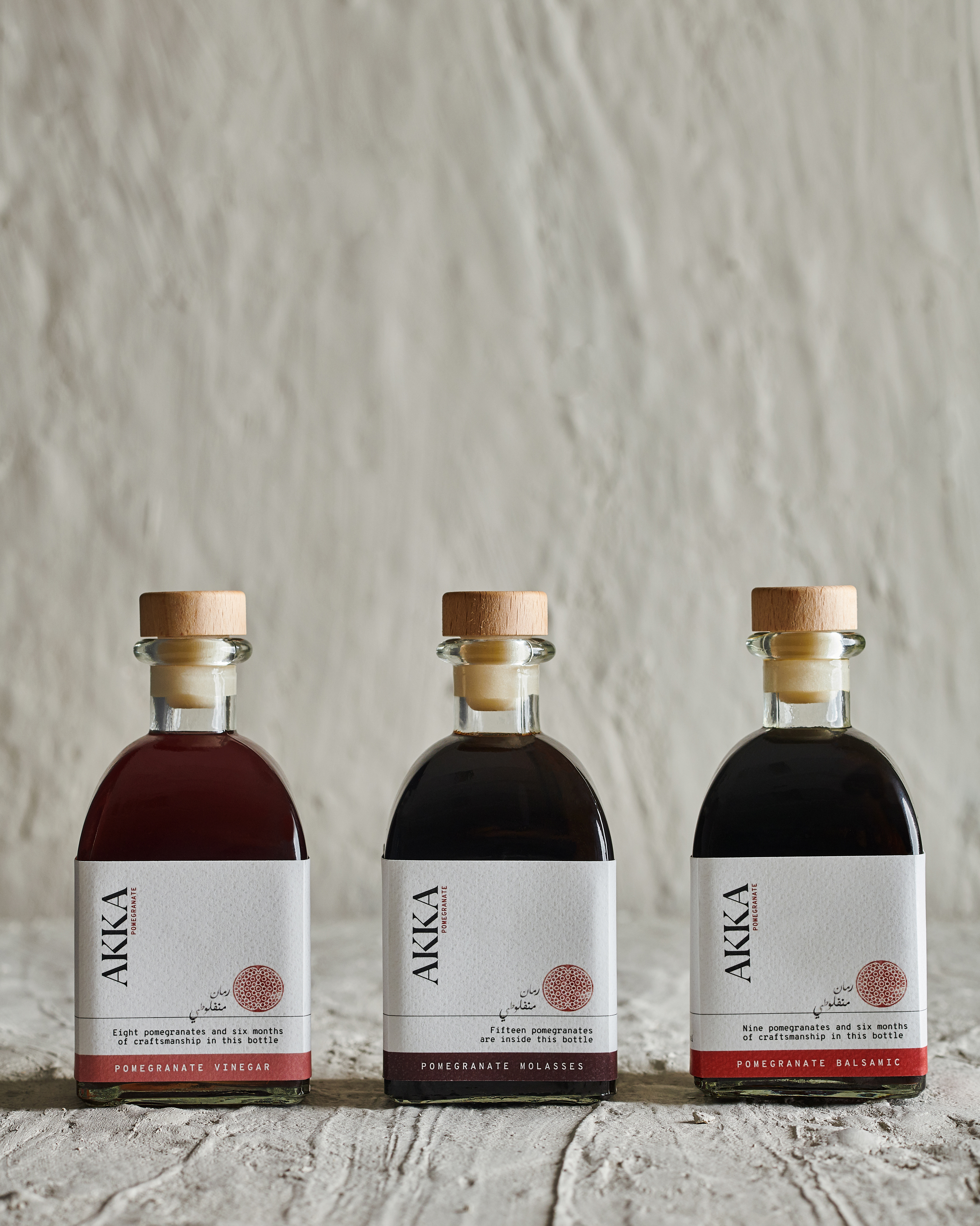
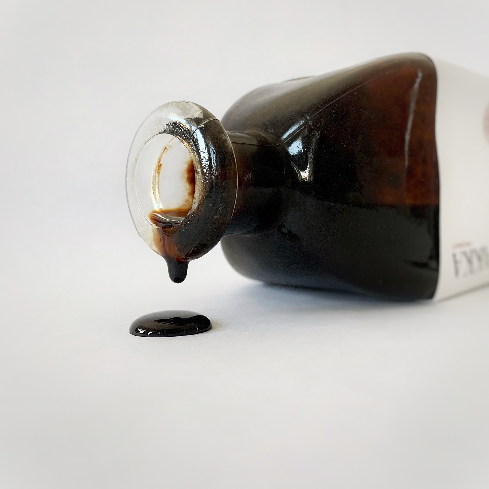
Three products made of pure Egyptian Manfaluti pomegranate – Balsamic, Vinegar and Molasses.
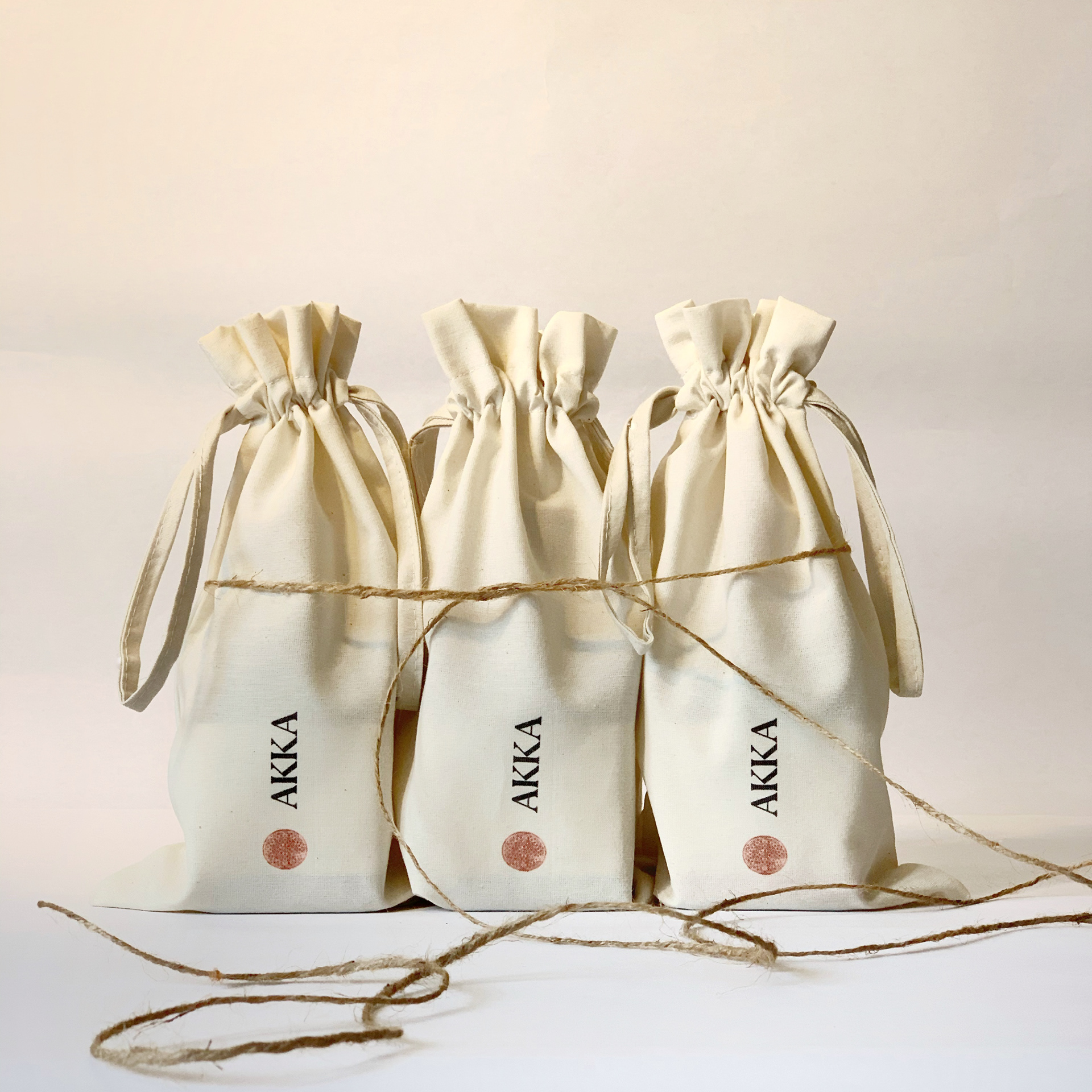
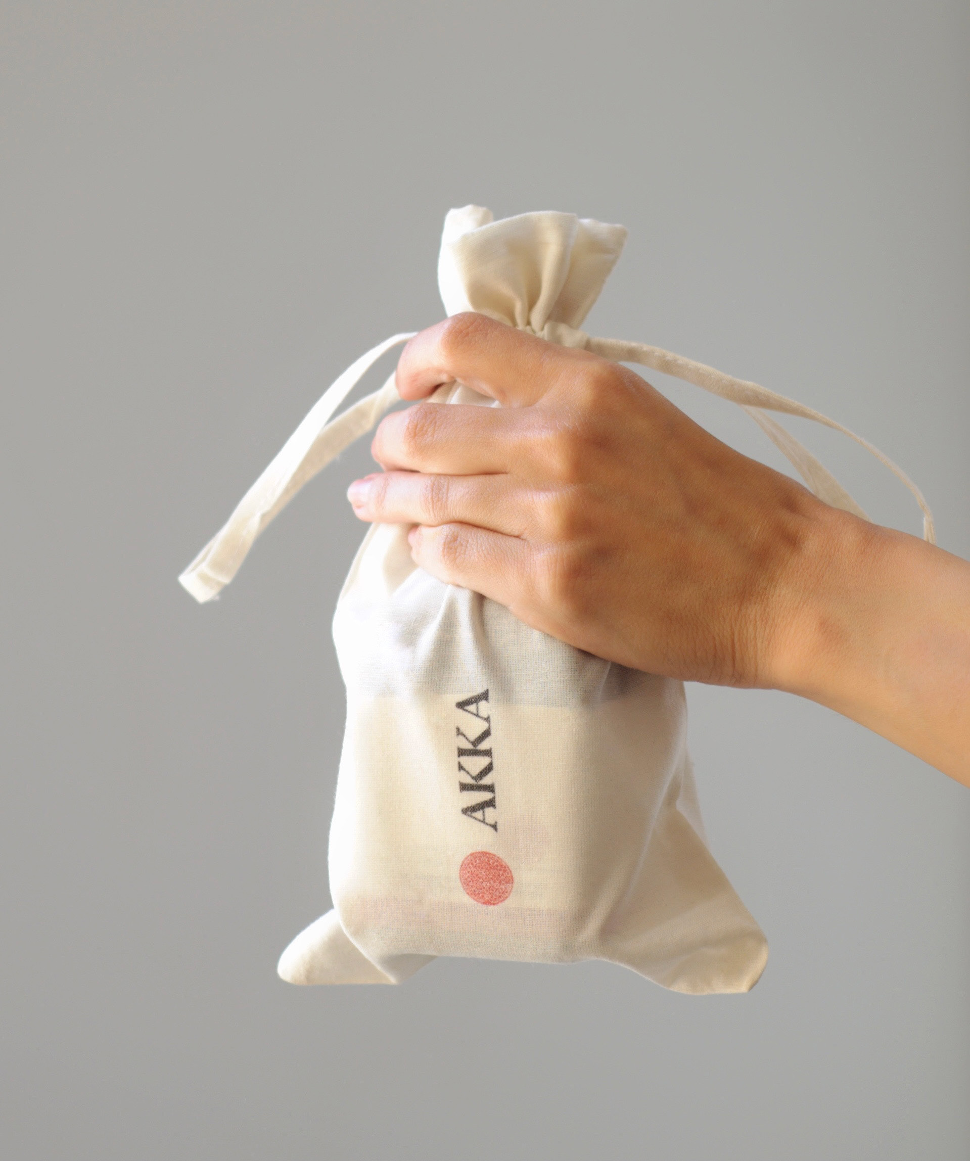
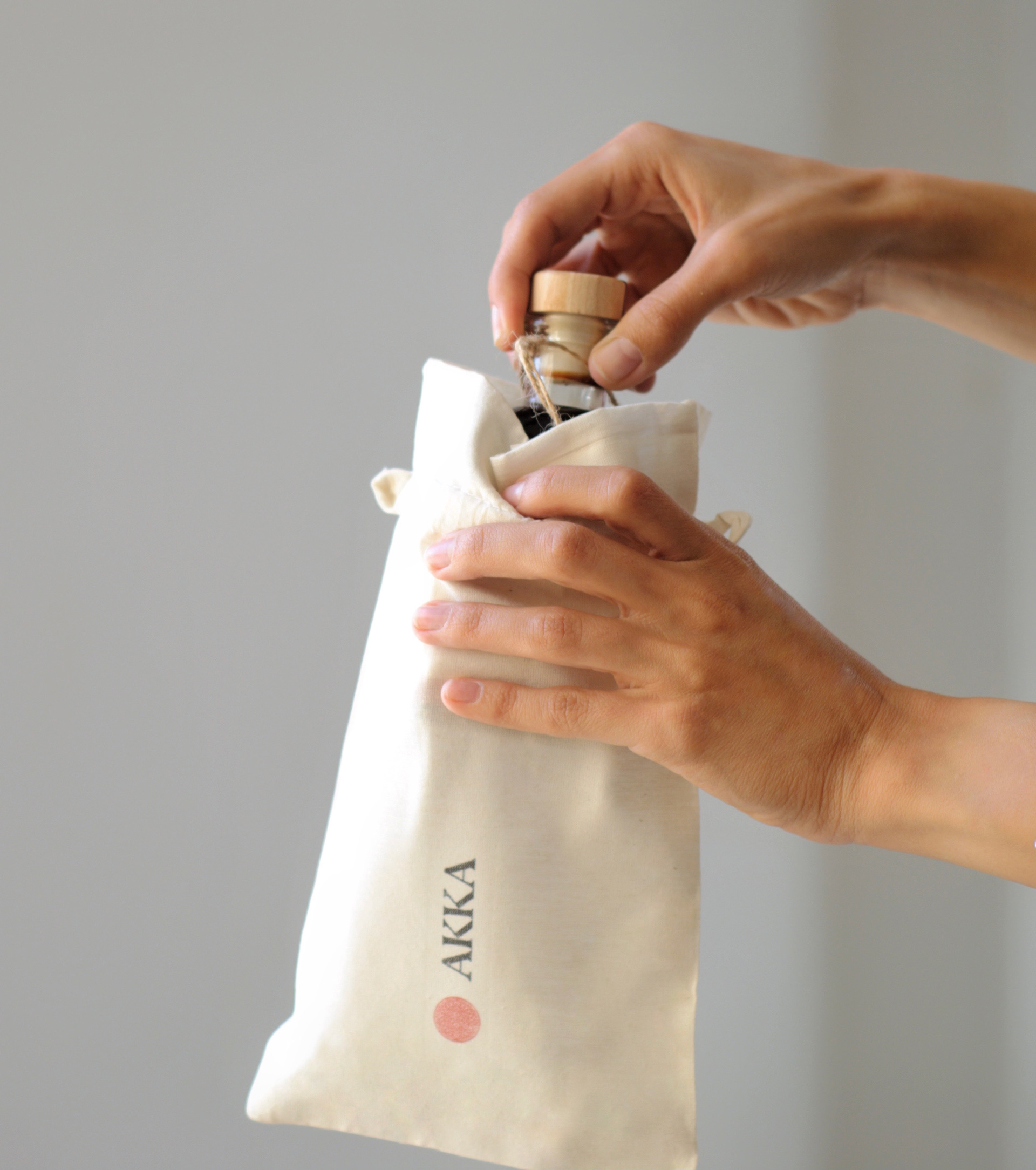
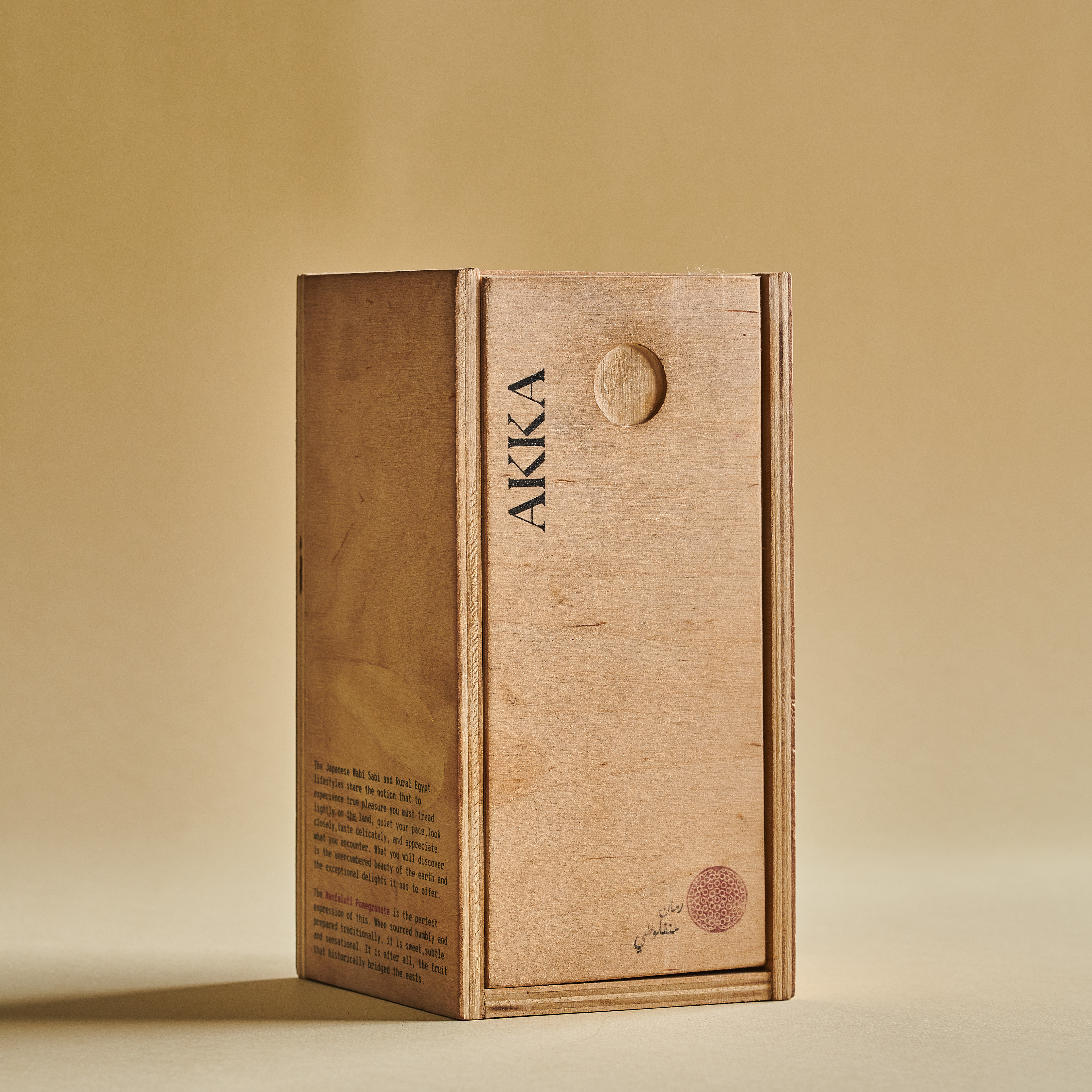
This production minimalism is reflected on the visual identity of the bottle with a sleek simple logo to translate AKKA’s refined delicacies. Championing the beauty and power of the Egyptian Manfaluti pomegranate, the pomegranate stamp is consistent through our visual communication, which turned out to be the perfect symbol of this brand identity.











Year / 2019
Client — AKKA
Agency — The Craft Collective (Formerly Studio Real)
Copywriting and Strategy — Dana Moussa
Brand Identity and Design — Miriam Melek
Photography — Keen Production
Instagram — @pureakka
Website — www.pureakka.com
Featured on the web:
